AGNOS
Mobile Application
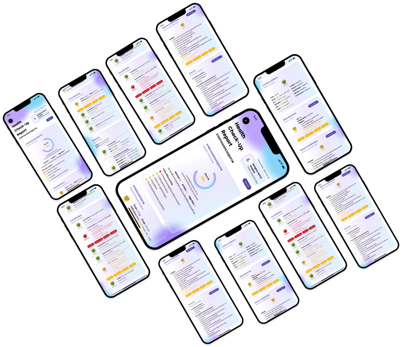
A UX/UI redesign project for the Health Checkup Report section in the Agnos application. The project focused on simplifying complex health information, addressing user pain points, and improving the overall user experience through a clearer information structure and an easy-to-understand one-page report design.

Agnos
Mobile Application
A UX/UI redesign project for the Health Checkup Report section in the Agnos application. The project focused on simplifying complex health information, addressing user pain points, and improving the overall user experience through a clearer information structure and an easy-to-understand one-page report design.
FUTURE IMPACT
In the future, the health check-up page in Agnos application can be further enhanced by incorporating Accessibility Controls, such as adjustable font sizes and weights, to ensure a comfortable experience for users with visual impairments like myopia or presbyopia. A single-screen accordion layout could be introduced to streamline complex medical data, allowing users to effortlessly toggle through treatment methods, causes, precautions, and sources without unnecessary page navigation. Additionally, expanding these features would improve usability, reduce cognitive load, and enhance overall readability, with the potential to evolve into a more patient-centered and inclusive platform for healthcare management.
HIGH-FIDELITY WIREFRAME


DESIGN SYSTEM

INFORMATION ARCHITECTURE (IA)
The Information Architecture of the Health Check-up Report was structured to transform complex medical data into an easily digestible, user-friendly experience. It prioritizes high-level summaries while allowing seamless navigation into detailed clinical results
.jpg)
TIMEFRAME
3 days
ROLES
-
Visual Design
-
UXUI Design
-
Prototyping
-
User Reseacher
SOFTWARE
-
Figma
SUMMARY OF USER INSIGHT RESEARCH
Participants:
-
4 female officer workers (aged 24-35 yrs) : varying levels of understanding, rely on summaries
-
1 male self-employed (61 yrs) : detail-oriented, seeks full understanding
-
1 female unemployed (64 yrs) : high anxiety, reassurance-seeking
User Needs:
-
Plain-language explanation for each result
-
Clear prioritization (what matters most & urgency level)
-
Specific next steps (what to do, what to avoid, when to act)
-
Easy-to-read format with visual support
-
Reassurance and clear explanation to reduce anxiety
-
Contextual explanation (why this result matters and how serious it is)
Core Insight :
-
Users don’t need more data — they need clarity, guidance, and reassurance to understand and act on their health confidently
Key Insight :
-
Users understand only surface-level (normal vs abnormal), not deeper meaning
-
Strong need for translation of medical data to simple language
-
Users struggle to connect “result to what to do next”
-
Emotion affects behavior (anxiety, overthinking, or ignoring details)
-
Users want quick summary first + detailed info later
-
Trust in doctors is high, but users lack support when doctors aren’t available
Pain Point:
-
Understanding Issues
-
Medical terms are hard to understand
-
No clear prioritization
-
-
Action Gap
-
Lack of actionable recommendations
-
-
Emotional Issues
-
Anxiety when seeing abnormal results
-
-
Behavioral Issues
-
Need to search external sources
-
Low engagement when results don’t seem serious
-
LOW-FIDELITY WIREFRAME

USER INSIGHT RESEARCH
Research Methodology :
I conducted semi-structured interviews with 6 participants who have experience with health checkups to explore their experiences with health checkup reports. The interviews focused on how users interpret their results, the challenges they get, and what they need to better understand and act on their health data.
Research Overview :
The goal of this research is to identify key pain points in understanding health checkup reports and explore how to improve clarity and usability for users.
Interview Questions :
-
Have you ever had a health checkup before?
-
How do you understand your health checkup results?
-
Which parts are confusing?
-
Do you usually ask a doctor to explain?
-
What information is most important for you in a health checkup report?
-
If a health checkup report used AI to simplify results into categories such as "Normal", "At Risk", or "High Risk", would that help you understand your health better? Why or why not?
-
How do you usually feel when you receive your health checkup results?
